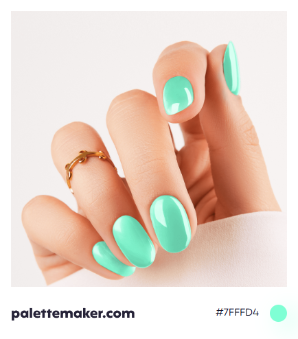
Aquamarine Color
HEX color code is #7FFFD4 and the RGB is 127, 255, 212
A greenish light shade of blue, that is associated with the tranquility of waters and growth of nature. With an added luxury due to a gemstone with this same beautiful hue.
How the color is made: aquamarine can be achieved by mixing blue and green with a white base. In RGB color space, it is comprised of 127/255 red (~49.8% of red), 255/255 green (~100.0% of green), 212/255 blue (~83.14% of blue). And in CMYK color space, its CMYK components are 50% cyan and 16% yellow, without any magenta or black.
History: aquamarine was named after the gemstone and the first usage of the word to describe the color in English was in the end of the 16th century. And the color, oops the gemstone, never ran out of fame sense its discovery. The color then went on to be dominant in fashion as whole. The color, even though not intended, appears in many light blue paintings from Van Gogh's to Picasso's.
Color in Action
The color, like other blues, inspires the feeling of comfort, relaxation and peace. Due to the lightness of aquamarine, it can be a symbol of purity, openness, and trust. Also, sue to its associations with the gemstone, it may convey status and authority. In jewelry, aquamarine is considered one of the gemstones to gift your loved ones to convey how much you trust, and admire them.
Colors that go with Aquamarine
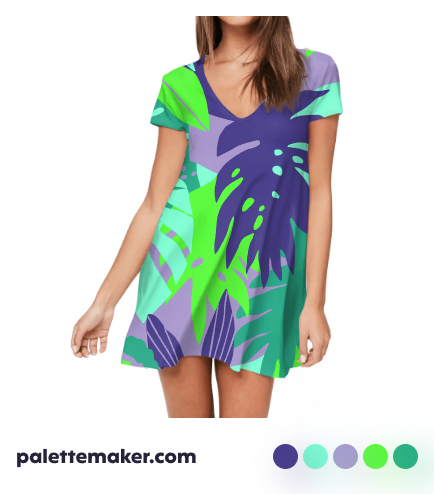
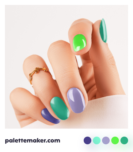
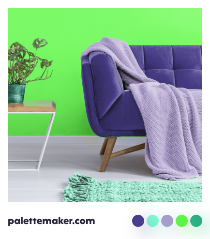
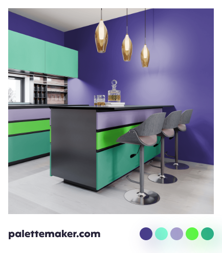
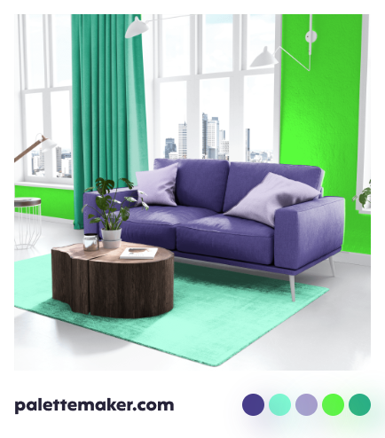
Aquamarine matches well with light green, turquoise and other sea-inspired colors, and together they bring the waters inside home, and give a great sense of retirement. Yet, in order to push away the dullness, you can use a warm color such as pink, light fuchsia, or light salmon. Pale red-orange, dark pastel violets and greenish yellow might also be great additions to your palette.

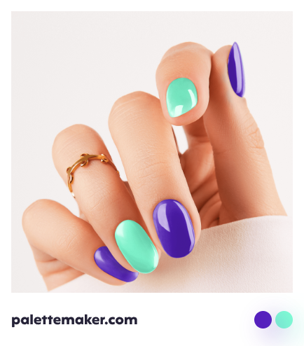


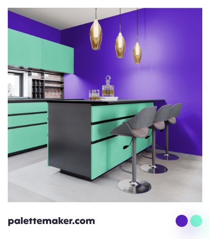

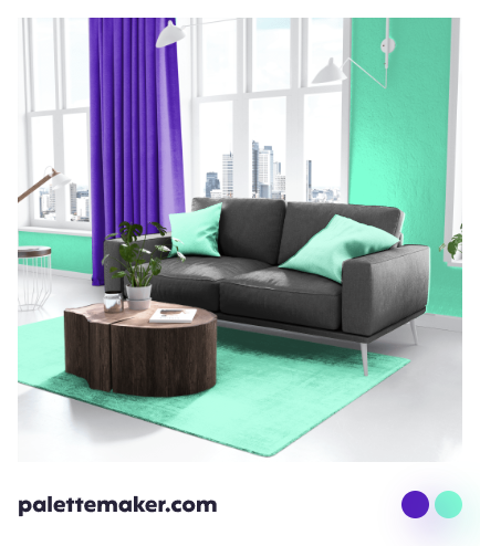


Aquamarine Color Palettes and Schemes
To create a beach vibe, use aquamarine beside other shades of blues and sand. You can also base your palette on solely aquamarine and red-orange beside a neutral, and the palette would look drastically simple, yet equally interesting. Instead, you can incorporate white as a base with yellow as an accent to a palette with aquamarine as a primary color.




Backgrounds and Seamless Patterns
Unlike other blues, aquamarine backgrounds wouldn't seem extremely dull, but the will add a sense of life to your graphic, thanks to the green undertone. Patterns that are sea-inspired seem like a perfect fit to aquamarine, yet don't forget to look up and aim for the sky, as cloud patterns are also great choices for our color. What is more beautiful and abiding by nature than an aquamarine wallpaper? You can use the plain color, a pattern, or an art based on our color as a wallpaper for both physical and digital media.
