Color Theory
Basic color theory and how to apply it while making color palettes at PaletteMaker.com
The rules for color are not black and white
Although this article only covers the fundamentals of the topic of color, there is still more to learn. Combining technique and intuition is how you apply your knowledge of color, and practice is the best method to develop intuition. Utilize every opportunity to select color schemes, elicit particular emotions, experiment with color and light, and attempt new pairings.
Study Of Colors
The colors we see are the result of light waves that have been reflected off an object. The color of an object is determined by the type and amount of light that it reflects. Color theory and the way they interact with each other is a form of design that is used in many different parts of life, such as advertising, painting, fashion, and interior design.
Color Wheel
A color wheel is a diagram that shows colors in a specific order based on their chromatic connection. Twelve hues make up the basic color wheel, which can be divided into three categories: first, second, and tertiary grades.

12 Colors from Color Wheel
Color Harmonies
Color harmony is when you use two or more colors together to create an aesthetically pleasing design. You can use complementary or triadic schemes to achieve this effect. Complementary schemes are when you use two of the same hue but opposite on the color wheel and triadic schemes are when you use three hues that are equidistant on the color wheel.

Complementary

Analogous

Triadic

Tetradic

Square

Split Complementary
Color Harmonies in action
Complementary
Analogous
Triadic
Tetradic
Square
Split Complementary
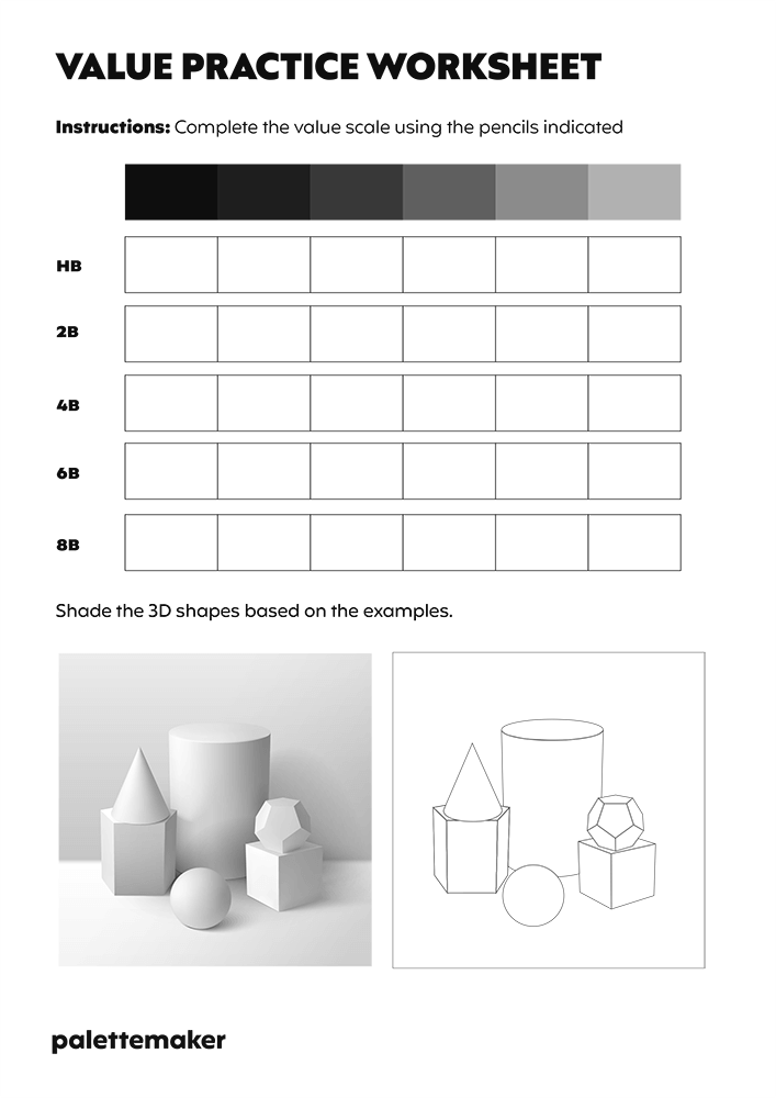
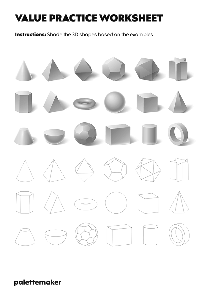
Color Value
Most paintings need to have a good value pattern throughout, which requires a distinct and organized arrangement of dark, middle, and light values. This will produce an attractive and functional design. It also aids in conveying your painting's message in an understandable and uncluttered way. Keep in mind that in a painting, these values should be predominately light or dark rather than equal. A static image with equal amounts of light and dark lacks movement, drama, and-most importantly-interest.

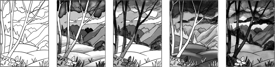
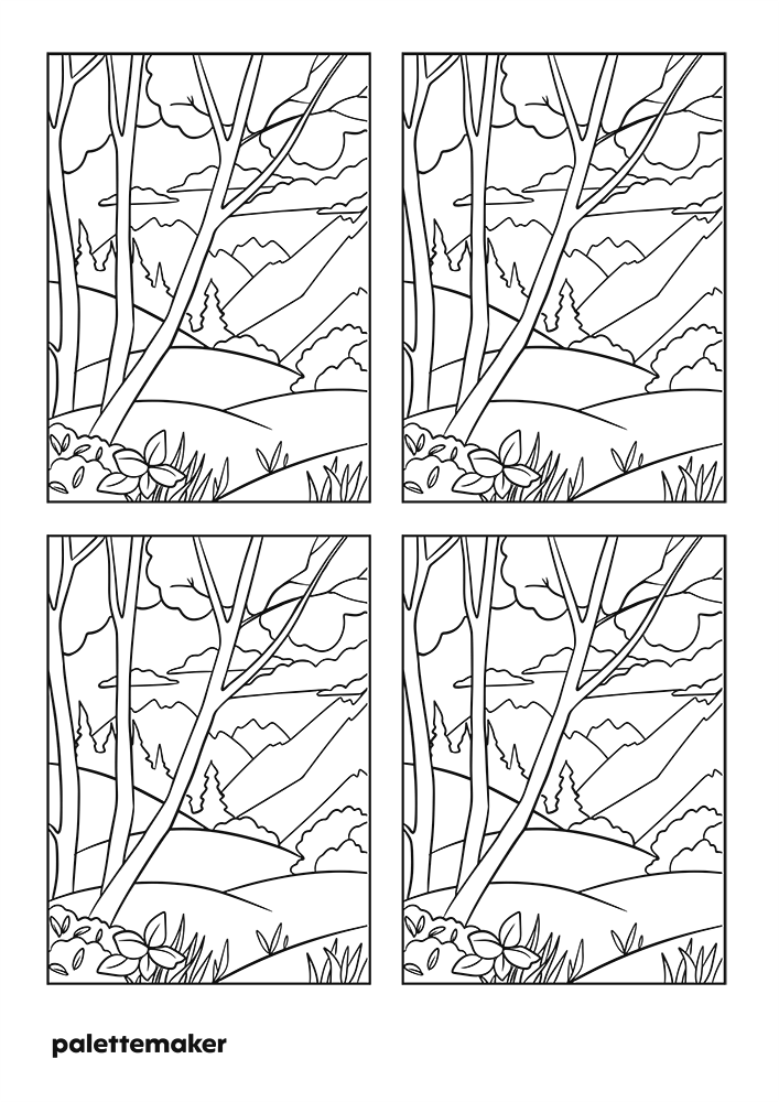
Paint your subject four times using the colors of your choice, following your value sketches like a road map. Compare the values of your colors to the values of your sketch while frequently squinting. Squinting will help you see value more clearly because vivid, bright colors can appear lighter than they actually are. A middle-gray palette is used when blending colors as another method for evaluating color values. This will enable you to determine whether a color is dark or light.
Examples

Poor value example

Good value example