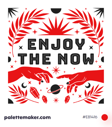
Red Color
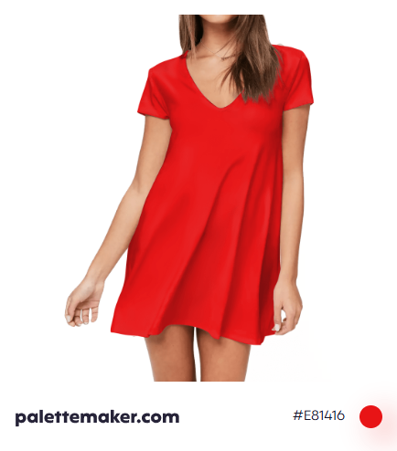
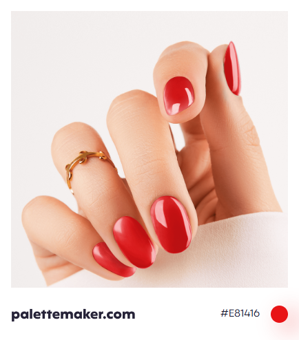
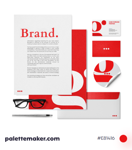
HEX color code is #E81416 and the RGB is 232, 20, 22
Along with black and white, red was one of the first colors used by humans, it is universal symbol of intense emotions such as love, passion, anger and revolt.
How the color is made: the color red is one of the primary colors in the RYB classical color system, as well as in RGB used in screens, it is made with 255/255 red or the full range of red. In CMYK color space it can be made by mixing full range magenta and yellow.
History: the earliest found drawings of red dates back to the 16th century B.C. And humans then used natural red dyes such as blood and red dirt. Then we started to use red ochre in various art forms. Also it was used by ancient Egyptians where it was associated with celebration and vitality, but also with evil and destruction. In Byzantine, it was associated with wealth and social status. But it was also relevant to revolutions, hence it was used in many movements throughout art history.
Color in Action
The clearest messages of emotions can be delivered with red where no word is capable to fully capture them. It appears full of emotions and feelings, ranging from love and passion to anger rage. Yet, some of the negative associations include uncontrollability which seems as very impulsive and irrational.
Colors that go with Red
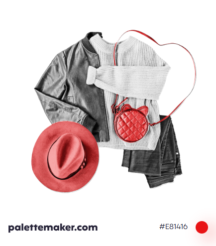
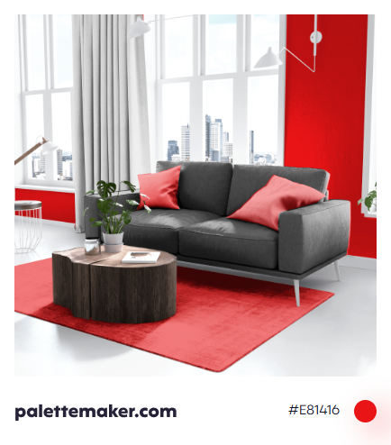
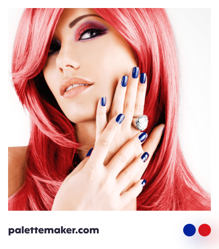
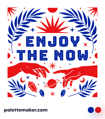
Red is a hot color, meaning it pairs well with cold colors such as blue, or better yet aqua. Colors that get along with red include, pink, orange, azure, green, magenta, and violet. Not to forget neutral colors such as grays and black.
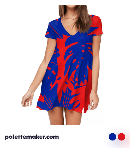
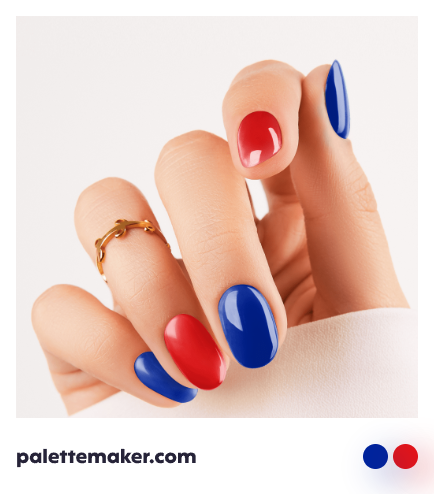
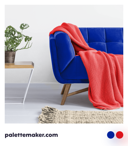
Red Color Palettes and Schemes
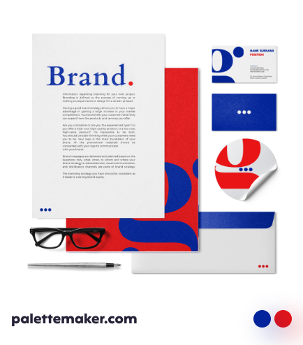
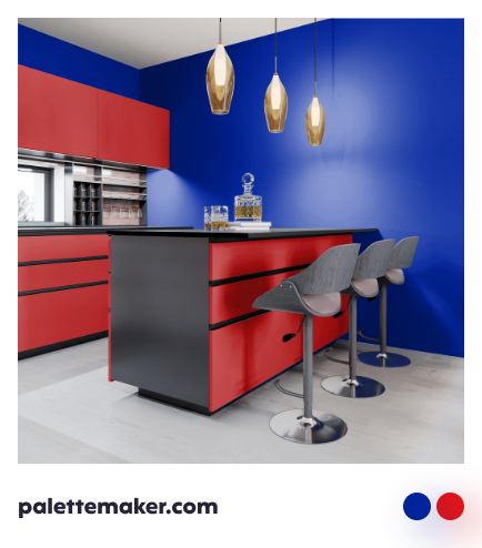
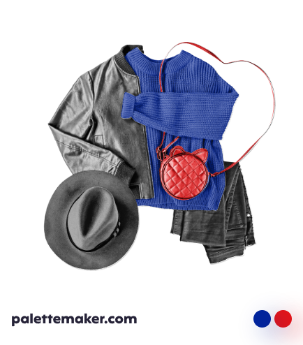
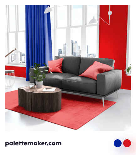
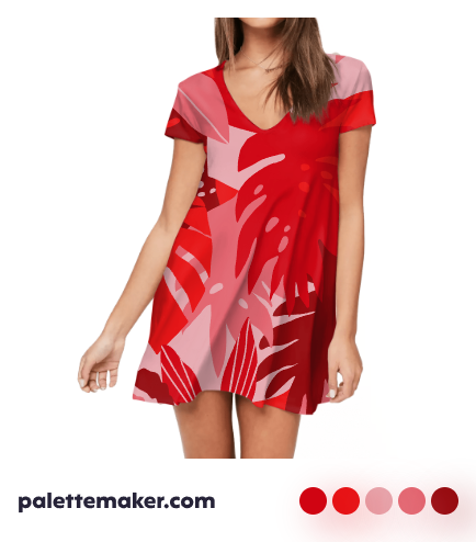
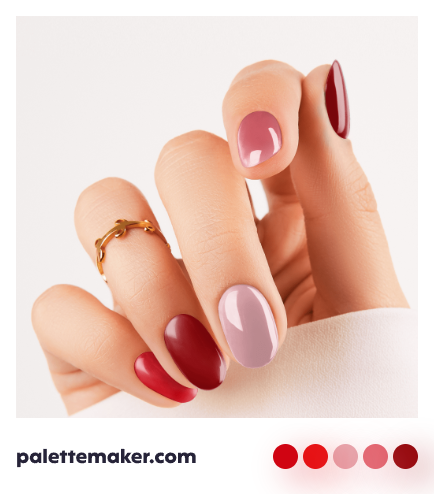
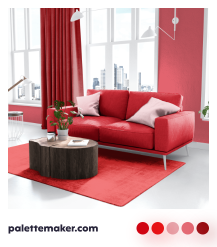
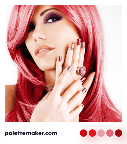
Shades of red and pinks create enthusiastic color palettes. But to add some life to red, it is better to pair it with a green color, look at strawberries! Though, you can also red with blue to create a balanced color palette.
Backgrounds and Seamless Patterns
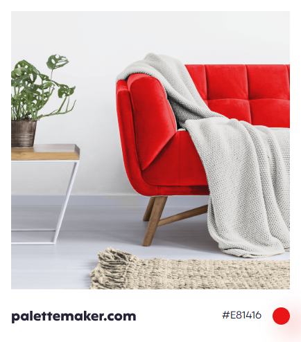
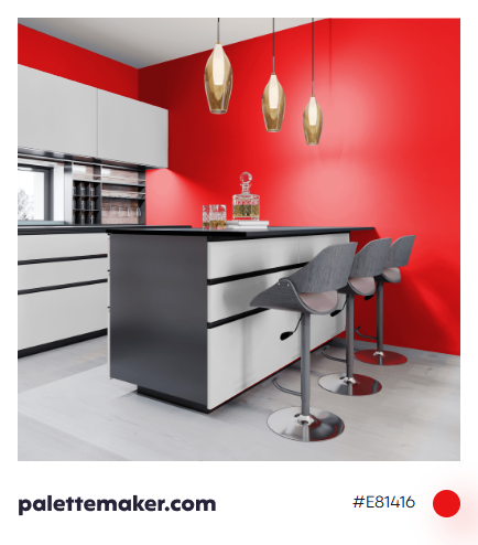
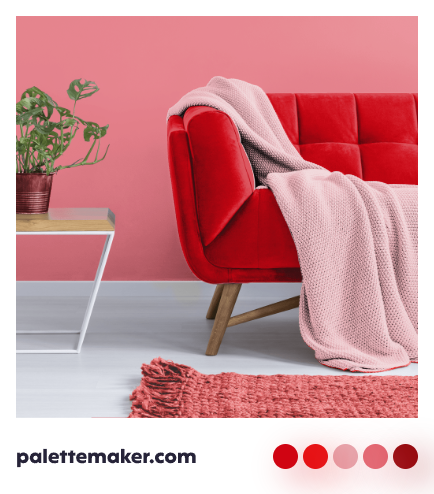
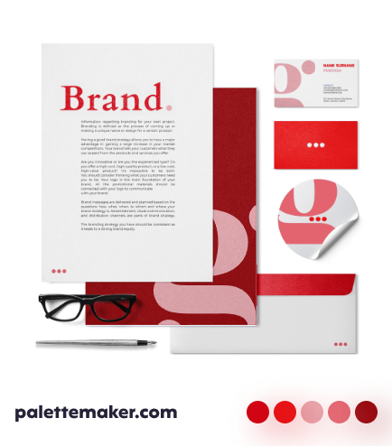
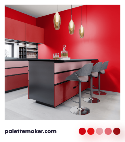
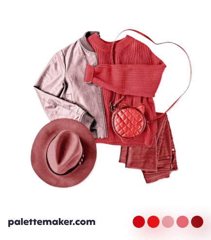
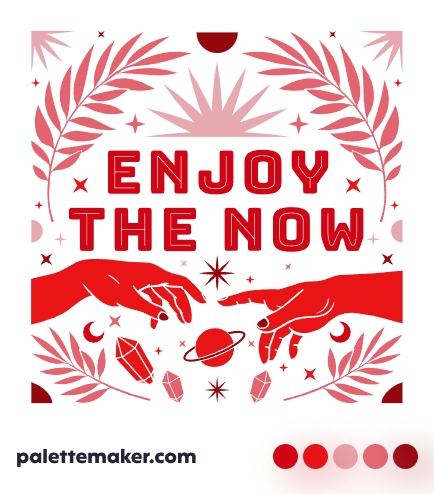
Red isn't a great color to be used in backgrounds, though it works best as an accent color instead you can darken, soften or tune down red. Pattens of all kinds fit being rendered in red, but it is better to base the pattern on a neutral color. Wallpapers are like backgrounds, as pure red is harsh on the eye, but if used in small quantities alongside a neutral or a blue, it will create great color palettes that are really cool.
