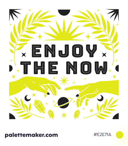
Chartreuse Color
HEX color code is #E2E71A and the RGB is 226, 231, 26
A lively yellowish green color that holds resemblance of life and rebirth borrowed from green, with a blend of happy optimism taken from yellow. Let alone its association with the refreshing French liqueur from which the color took its name.
How the color is made: the color is made by mixing yellow and green, and can lean towards any depending on its usecase. And in RGB color space, it consists of 226/255 red (~88.63% of red), 231/255 green (~90.59% of green), 26/255 blue (~10.2% of blue). And in CMYK color space, its components are 2% cyan, 88% yellow, and 9% black, with no added magenta.
History: as discussed above the color took its name from the French liqueur under the same name; and it was used as a color in the 19th century, even though various shades of chartreuse have been used by many artists over the course of history, for example it can be seen in Van Gogh's Café Terrace at Night amongst others. In fashions though, chartreuse had various ebbs and tides from the 18th century till now, when it made its way to fashion and fabrics, then running out of fame quickly. Yet in safety areas, it is still in use due to its high visibility, wether traffic jackets or even f as a color for fire fighters.
Color in Action
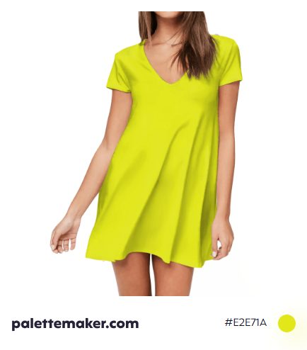
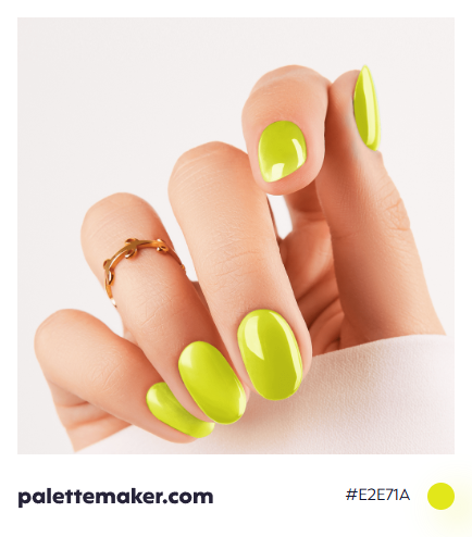
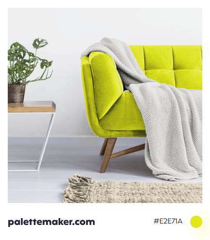
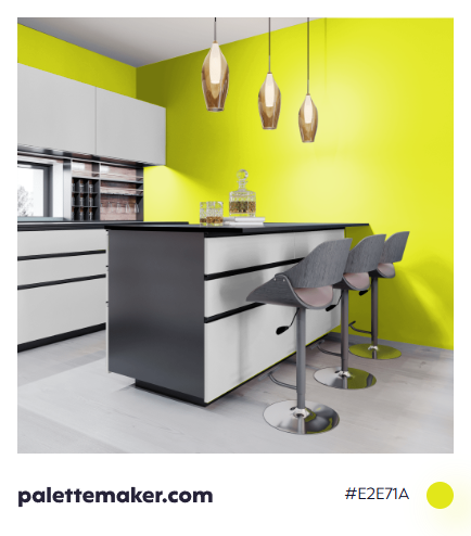
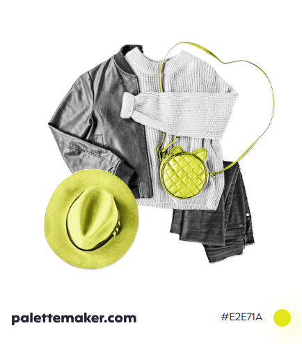
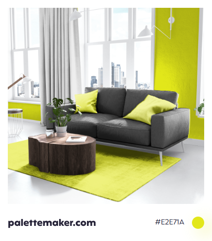
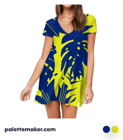
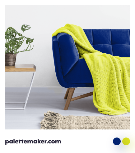
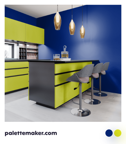
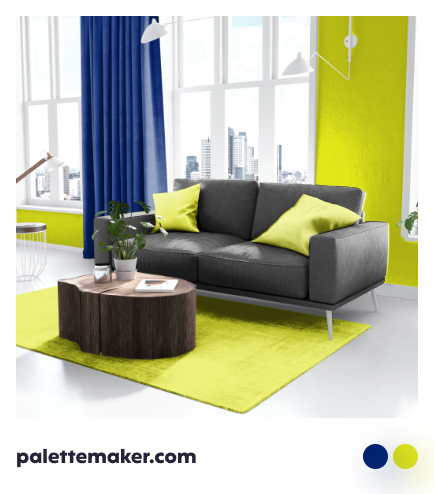
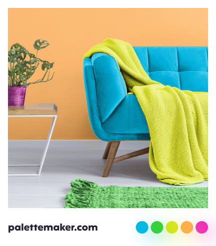
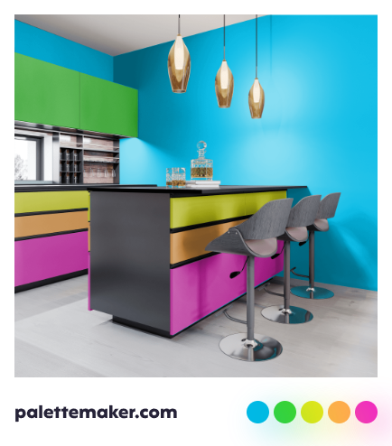
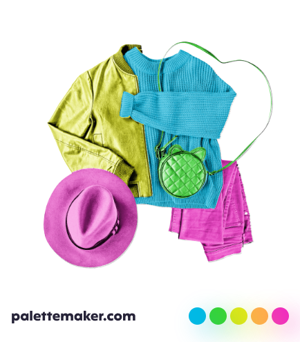
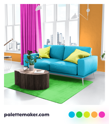
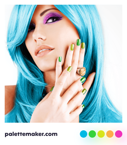
The color takes from both of its parents to present a unique mix of optimistic growth, and wishful happiness. That makes it a great clothing color for spring, yet it is better not to use it as primary color because it is overwhelming to the eye. Chartreuse seems positive, energetic, cheerful, healthy and healing if used in interior design, but we ca see it often in furniture or as an accent or highlight due to over-stimulant nature of the color.
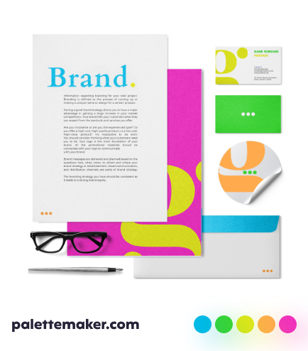
Colors that go with Chartreuse
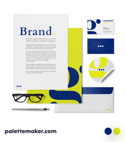
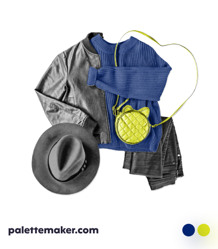
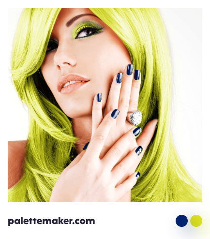
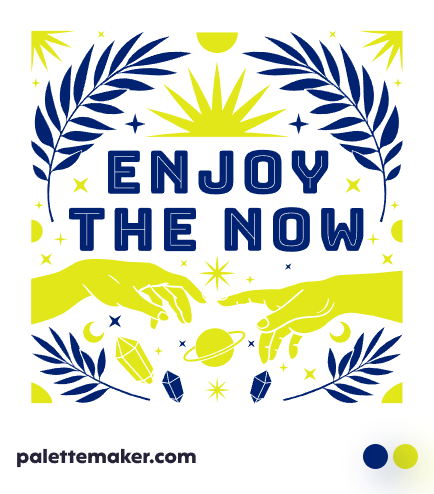
Chartreuse works best with close by colors such as beer, notice they are both beverages, and light green. To provide the most contrast to your palette use dark blues as a base and chartreuse as an accent, or you can replace blue with navy blue, blue-violet, light blue or magenta. But for a sophisticated look, use chartreuse with light neutrals such as ivory, light grays, cream or white.

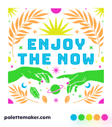
Chartreuse Color Palettes and Schemes
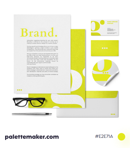
To create a modern color palette, use a light neutral as a base with chartreuse as a secondary or an accent color. Instead of neutrals, you can base the palette on a dark blue color such as navy blue. If decided to use chartreuse as a base color anyway, you can use deep reds, and browns as accents. Chartreuse can be used alongside shades of green and shades of yellow for an interesting analogous color palette that fits to be used in graphic design rather than interior design.
Backgrounds and Seamless Patterns
As recommended above, it is better not to use chartreuse as a background color as it might overwhelm your viewers, yet that is not true all the times, as you can use chartreuse as a background color for paintings depicting nature, especially if it is a close up drawing for a recent plant. Patterns of nature can be base on a neutral, with chartreuse as a main color, and they would be wonderful, these patterns are great to be used as wallpapers for bath printed media or screens, as well as other paintings that are based on this beautiful hue.