Periwinkle Color
HEX color code is #CCCCFF and the RGB is 204, 204, 255
As lovely and unique the name is, periwinkle is a very gentle and comfortable-to-look at, which can be seen as both a very light blue or a lavender purple.
How the color is made: periwinkle can be made by starting off with red and white to create a pink base, then add blue to get to that purplish tinge. And in RGB color space, its RGB components are 204/255 red (~80.0% of red), 204/255 green (~80.0% of green), 255/255 blue (~100.0% of blue). And in CMYK color space, it consists of 19% cyan, 19% magenta, without yellow or black.
History: periwinkle got its name from the flowers, it was first used in the 20th century in English to describe the color, even though it had been used by artists for a long time. For example we can see it in 1874 painting "Portrait of Madame Monet" by Pierre-Auguste Renoir. A similar color "very peri" was nominated by Pantone to be the color of the year 2022.
Color in Action
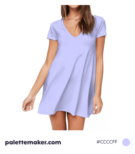
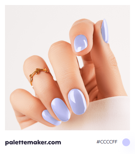
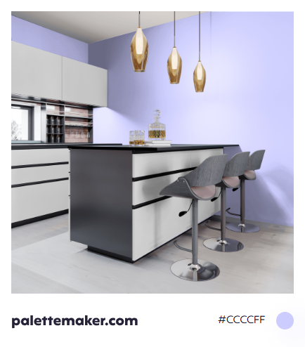
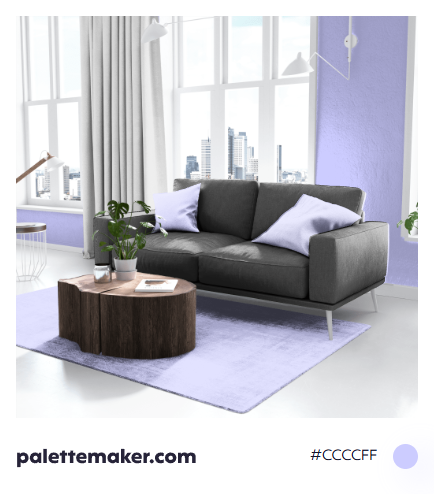
The color isn't as cold as pure blue, it resembles honesty, friendship,, relaxation, peace and calmness. Yet due to its light tone that contains a lot of white, it is considered a color of purity and innocence; hence it is a favorite color for children and kindergarten painting, toys, ... etc. Recently, it became associated with femininity as the color is elegant and soft let alone its relevance to flowers.
Colors that go with Periwinkle
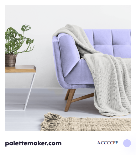
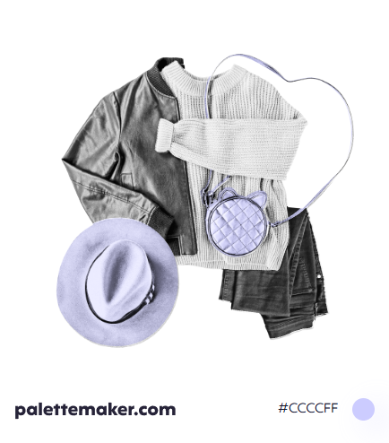
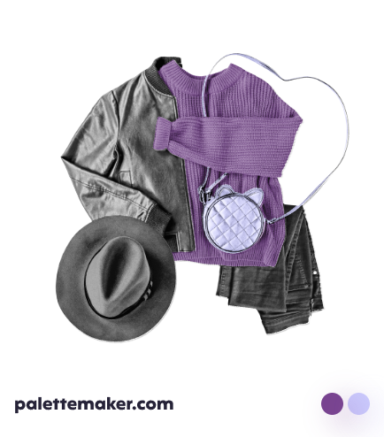
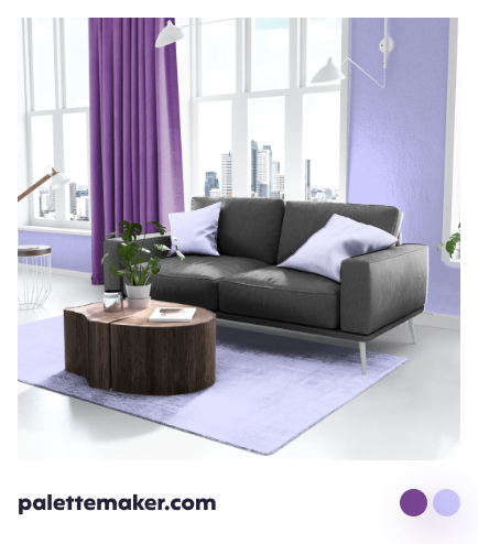
Periwinkle works well with multitude of color due to its closeness of being a neutral. It works well with yellowish neutrals, but also it is great to be used with any light color, especially pale lavender, pale blue, light pink, light cyan and also khaki and beige.
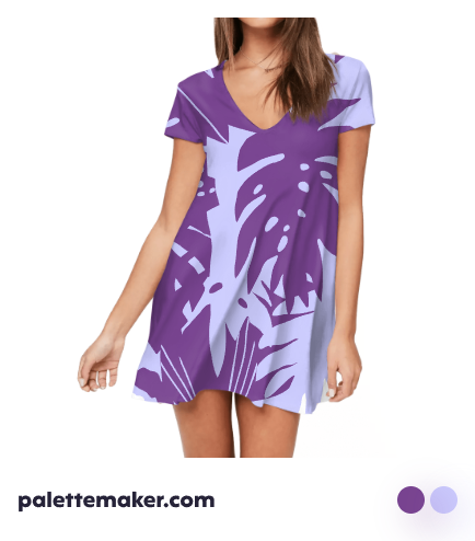
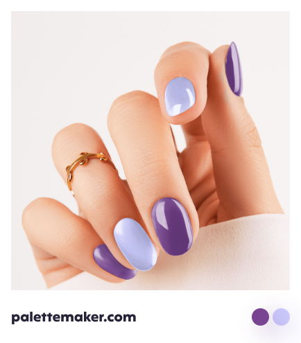
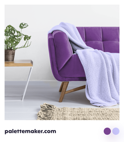

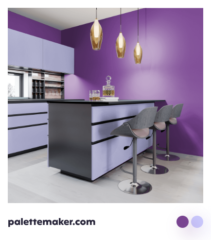


Periwinkle Color Palettes and Schemes
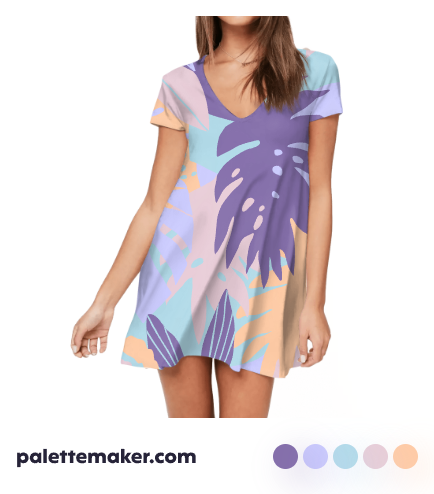
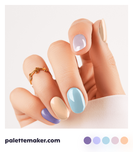
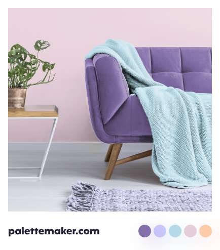
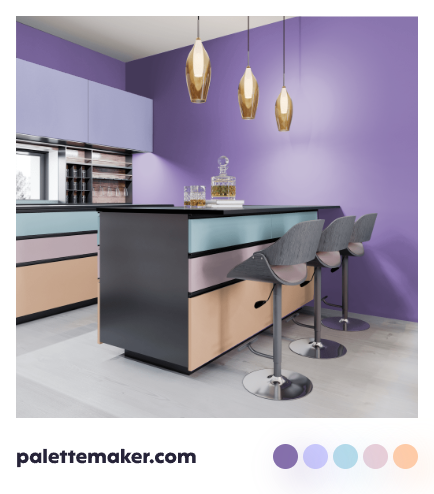
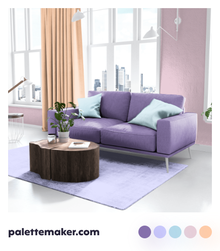
To create an analogous color palette, use periwinkle with other shades of blue, yet for adding more life use a green such as matcha. But for adding more temperature to your palette use periwinkle with yellow and red orange, it is better to base your palette on a neutral such as cream. And for a feminine color palette, pair periwinkle with pink and coral.




Backgrounds and Seamless Patterns
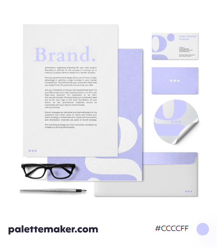
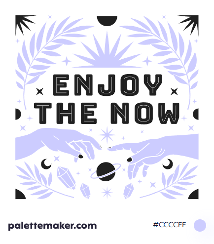
Due to the muted tone of periwinkle, it can be used as a background color for multiple kinds of graphics. Patterns of flowers, are obviously a great pattern choice for periwinkle, yet it is equally beautiful for geometric patterns, as it adds some softness to them. Using periwinkle as a wallpaper, wether the color is plain, a pastel gradient, a pattern, or even a graphics based on it, would create a calming and soothing effect.
